While working through website accessibility issues in my primary position, some of the most difficult items to fix (most especially from a design standpoint) are issues surrounding color contrast and link identification. When working through these issues it’s easy to utilize color contrast checkers to hit the contrast ratios desirable for WCAG AA or AAA accessibility, but to truly understand why these accessibility standards are in place, sometimes you need to see things for yourself.
Designers love subtlety. I’m definitely guilty of this, even on this very site. But working in fields like web design and web development, which each has infinite numbers of branches and topics of importance to keep up on, it’s nearly impossible to remember every nuance. The least we can do is make good conscious efforts towards the goals we know we can take care of within scope and budget.
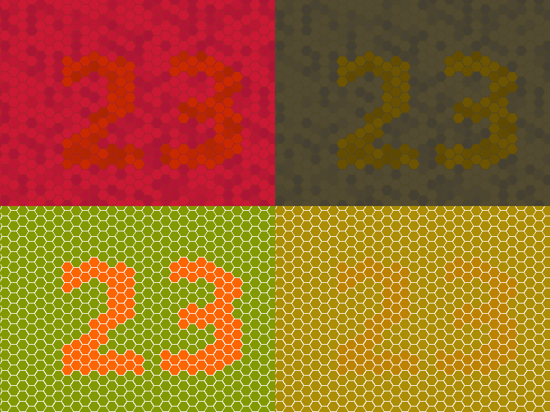
I, myself, am obviously not color blind, so looking at things through the lens of others’ was very informative to me and will likely influence my future in some important ways. According to ColourBlindAwareness.org, colorblindness affects an estimated 1 in every 12 men (8%), and 1 in every 200 women in the world. With numbers this high, you very likely know someone (or are someone) with a form of color blindness — some that may not even be aware of it.
In Practice
While color blindness obviously isn’t even the only form of visual impairment a web user can suffer from; the goal of this article is to help encourage other designers and developers to take a more proactive approach to their craft. I think we all, especially designers, take for granted being able to use subtle color shifts to indicate hover/active states because it’s just not something we have in our heads every day.
“As builders of the web, we have an ethical duty, in the interest of the common good, to planning and architecting our projects in ways that will be advantageous to all groups of people”
In large-scale web projects that need to be highly accessible to a large variety of ages and audiences, I’d argue that considering color blindness testing a necessity is definite, in addition to the many other simple things you can do to make websites more accessible. For smaller projects, while the budget or needs may be less of a priority, it’s quite arguable that creating an accessible product would be easier than at a large-scale, so why not put in a little extra effort?
As builders of the web, we have an ethical duty, in the interest of the common good, to planning and architecting our projects in ways that will be advantageous to all groups of people, visually impaired or not. As much as I personally can accommodate for others, I surely try. Do I check every box in most projects? Certainly not. But I know and understand guidelines on a basic enough level to know if the decision I’m making design-wise is a good one or not.
This stuff is always a two-way street in some regards, but working towards a goal of better accessibility is also a great way to learn more about its many intricacies. It’s often a push-pull relationship but ultimately usability should win every time.
Like most things regarding this industry, following just the most basic best practices in the beginning usually saves everybody time, money, and preventable issues in the future (and for some, even lawsuits.) With accessibility, in particular, it’s important that we delve into the WCAG guidelines to truly understand why they’re there, and take them into account to help build a better web for everyone.
For the Toolbelt
Here is a short list of free and paid tools you can use to test your projects against various forms of color blindness, as well as web accessibility in general, in no particular order.
Sim Daltonism
This app was perfect for what I was seeking — color blindness simulation — and quite clever in its implementation, at that. You’re able to pull up the app and it overlays your screen with a resizeable window with the colorblind simulator filter that you can select from the menu. You can click right through it, the overlay doesn’t affect anything below it except the color you’re seeing. It’s definitely my favorite that I’ll be using in the future.
WebAim’s Color Contrast Checker
A basic tool for a basic goal, it does exactly what it says it does. They make it easy to input the colors you’d like to test against each other than tweak them as needed to make them more or less contrasty, as needed.
SiteImprove
I use this in my primary position and I have to say — it’s thorough. More than once I’ve exhausted myself trying to resolve the accessibility criteria presented, and many times more than once their suggestions resolving issues has worked flawlessly. Not to say anything is perfect, but in the last few years of using SiteImprove, they’ve continued to change and improve their product offerings tenfold (including an entire suite of non-accessibility toolsets that are quite useful!)
While not a free or cheap alternative, any team with a decent budget and the drive to make sure their web projects are the best they can be, this product is a great way to fill the gaps.